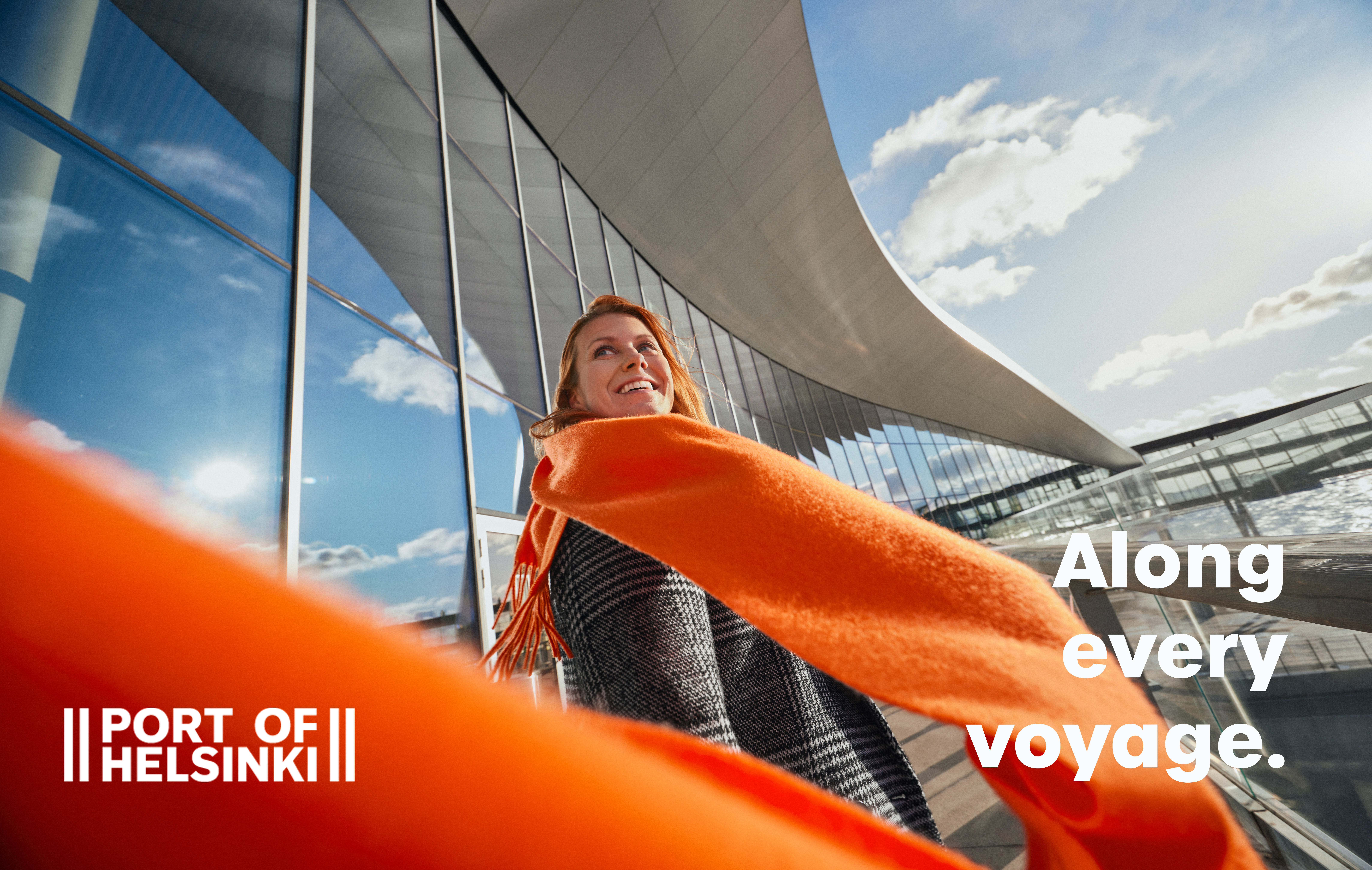
The Port of Helsinki’s updated visual identity shows how intertwined port operations are with the lives of Finns

Helsinki was originally established as a port town in the 16th century, and the port is still immensely important to us today. The Port of Helsinki’s updated visual identity highlights how integral the port is to both our capital city and Finnish society as a whole.
The foreign trade that passes through the Port of Helsinki makes it possible for us to enjoy the everyday conveniences that we are accustomed to: bananas, coffee, washing machines, trainers. Many industries are also dependent on the goods that flow through the Port, such as machine parts and ingredients.
The Port is also Finnish people’s gateway to Central Europe and the world, whether travelling for business or pleasure.
Inspired by marine nature
The Port of Helsinki’s updated brand elements tell a story. The colours have been picked from the Finnish marine nature surrounding the Port, and the accent colour is the orange that should be familiar to anyone working at the Port, seeing as how it is also used on work clothes. The font type is unpretentious and the logo remains unchanged, although some of the its coloured versions have been updated.
The new look is already being used in the Port’s updated customer magazine Kaija and on the updated website. During 2024, the visual identity will also become familiar to those visiting Helsinki’s ship terminals, for example.
The Port of Helsinki touches all of our lives. Sometimes indirectly, at other times directly. People, goods and food – they all pass through the Port. Trends and emotions. The Port is a place where thoughts and currencies are exchanged. Where business and lifetime memories are made. Every good success, love and holiday story starts here.
Port of Helsinki – Along every voyage.


